A peer-to-peer exchange platform — designed to make trading goods and services feel as natural as a conversation.
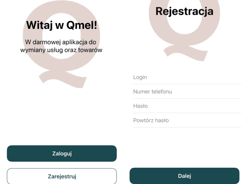
Qmel is a native mobile application for exchanging goods and services between individuals, built for both iOS and Android. The challenge was crafting a complete end-to-end user experience — from onboarding and offer creation through to proposal matching and transaction completion — that felt effortless across two distinct platform conventions.
The design process adhered strictly to Apple Human Interface Guidelines for the iOS build and Google Material Design for Android, ensuring each version felt native to its platform while maintaining a consistent brand identity. Static keymock prototypes were produced at every major milestone to validate flows before development handoff.
The result is a fluid, intuitive interface that reduces friction at every step — letting users focus on the exchange, not the app.
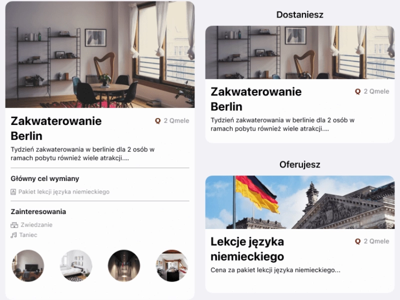
The project opened with a deep dive into the peer-to-peer marketplace space — analysing established players across both app stores to identify patterns in listing flows, trust mechanics, and search-to-match journeys. User interviews surfaced a recurring friction point: the gap between expressing interest in an offer and initiating a real conversation.
Personas for three primary user types were defined — frequent traders, occasional sellers, and service providers — each with distinct motivations and risk tolerances. These shaped every subsequent UX decision.
 User Research
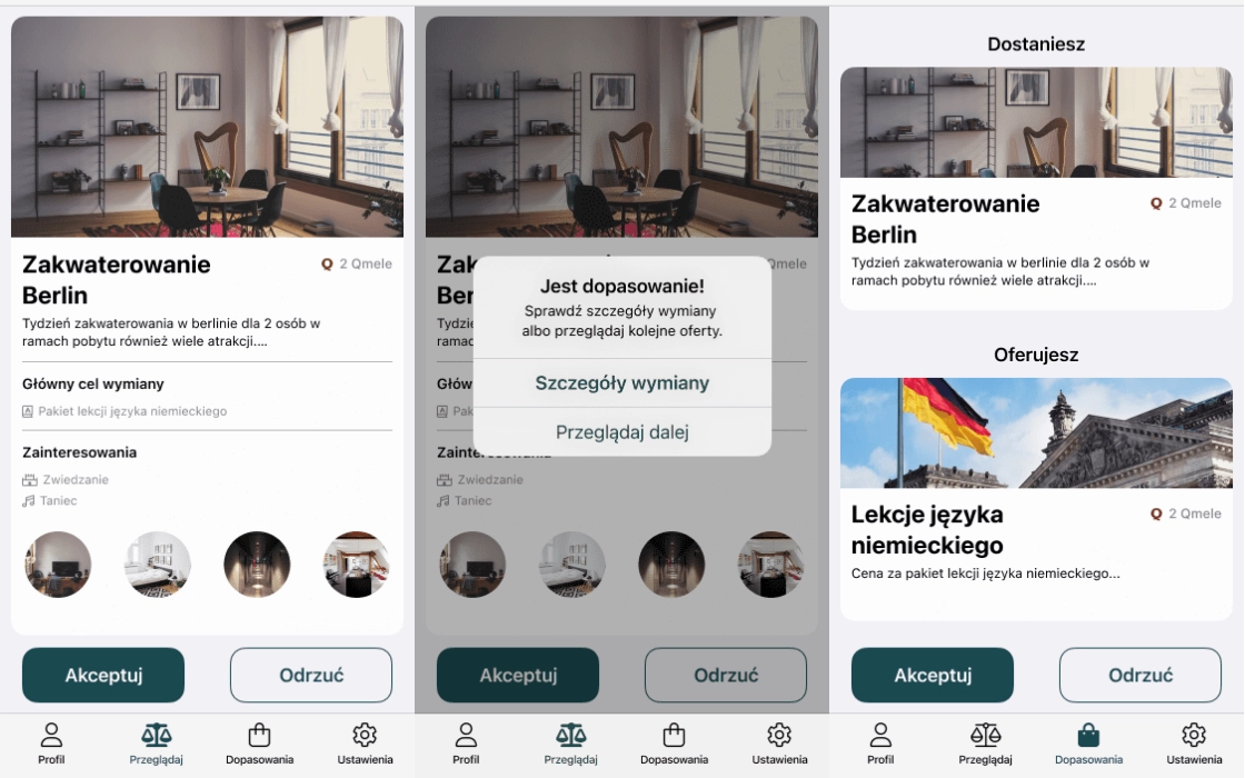
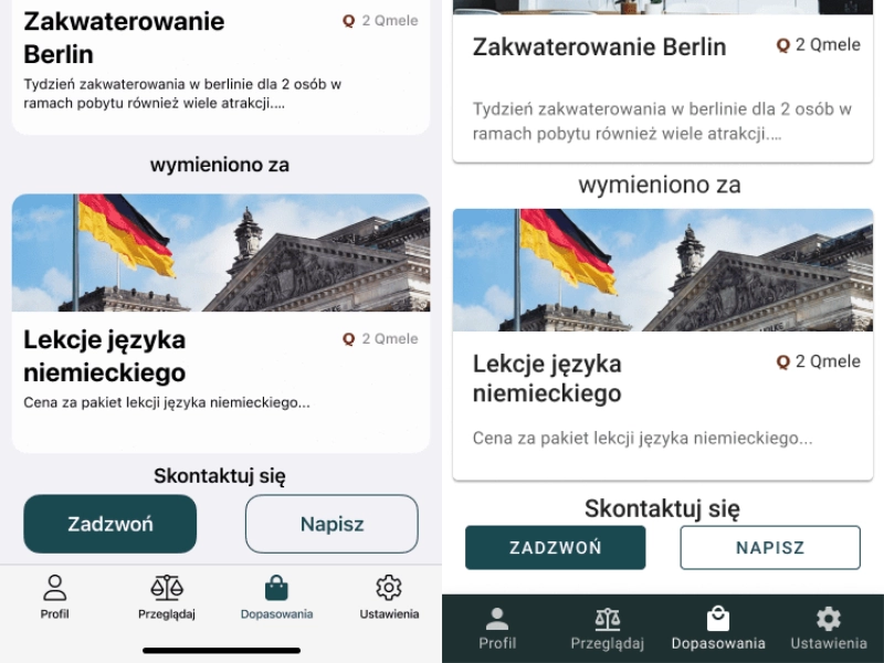
The core user journey — registration, offer creation, browsing, matching, and transaction — was mapped as a complete flow before any screens were designed. Each transition point was stress-tested for drop-off risk, and friction was reduced by pre-filling where possible and surfacing the right information at the right moment.
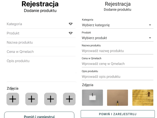
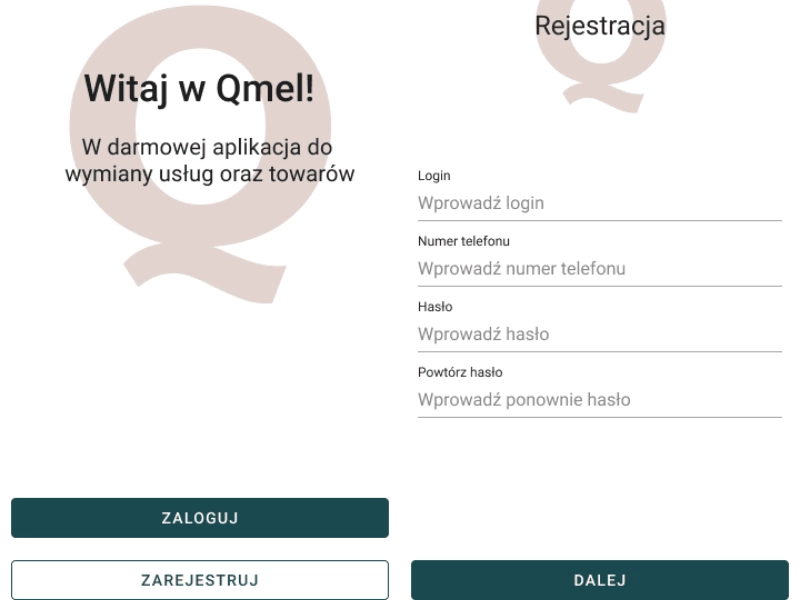
Low-fidelity wireframes covered all primary and edge-case states: empty states, error flows, loading skeletons, and success confirmations. Nothing was left to the developer's imagination.
 UX Design
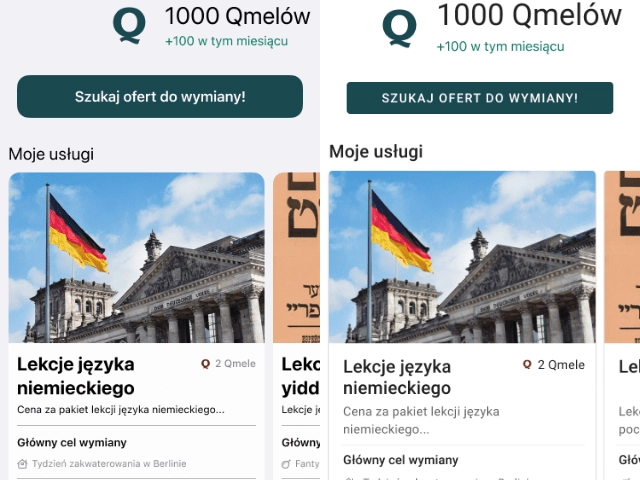
Two separate design systems were built in Figma — one for iOS following Apple Human Interface Guidelines, one for Android following Google Material Design. Components were defined at the atomic level: typography scales, colour tokens, spacing systems, and interactive states for every control.
Despite diverging in component conventions, both platforms share the same brand character — a clean, approachable aesthetic that builds confidence in the exchange. Every interactive state (tap, pressed, disabled, loading) was defined before handoff.
 UI Design
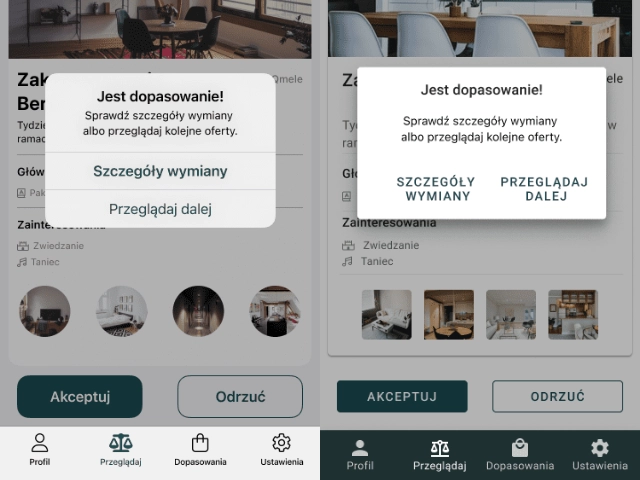
Static keymock prototypes were delivered at three stages — post-wireframe, post-visual-design, and post-revision — allowing the development team to validate flows in a realistic, clickable context without waiting for production builds. Feedback cycles were short and precise.
Final handoff documentation included annotated specs, redlines, asset exports for all screen densities (@1x through @3x for iOS; mdpi through xxxhdpi for Android), and a component glossary to keep implementation consistent with the design system.
 Handoff