A fully configurable white-label comparison platform — built to work for any product category, any brand, any scale.
The brief called for a generic comparison tool that could aggregate and surface a company's services within a single platform — without being tied to any specific product category. Whether comparing insurance plans, financial products, or subscription services, the interface needed to adapt without redesign.
High configurability was the central constraint: the client required an administrative panel through which non-technical staff could manage listings, adjust comparison parameters, and configure the visual output. This shaped every layer of the UX — from information architecture to component design.
The full scope covered wireframes and pixel-perfect UI for both desktop and mobile, plus a dedicated admin interface — 18 screens in total, designed to a handoff-ready standard across all breakpoints and states.
The opening phase focused on unpacking what "generic" actually required in practice. A white-label comparator serving multiple product categories cannot rely on domain-specific conventions — it has to be intuitive without any prior context. I mapped comparison tool patterns across e-commerce, fintech, and SaaS to identify the universal UX primitives that hold across categories.
Stakeholder workshops defined the configuration scope: which elements would be fixed brand-level, which would be client-configurable, and which would be dynamic per listing. These decisions formed the foundation of the information architecture.
 Discovery
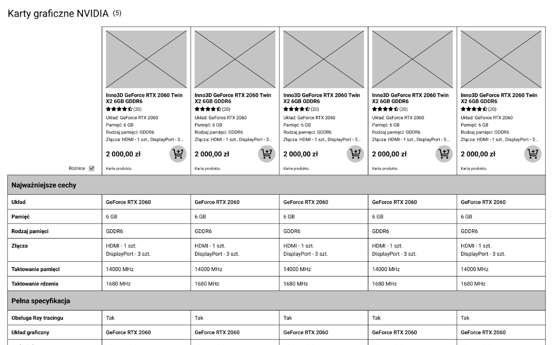
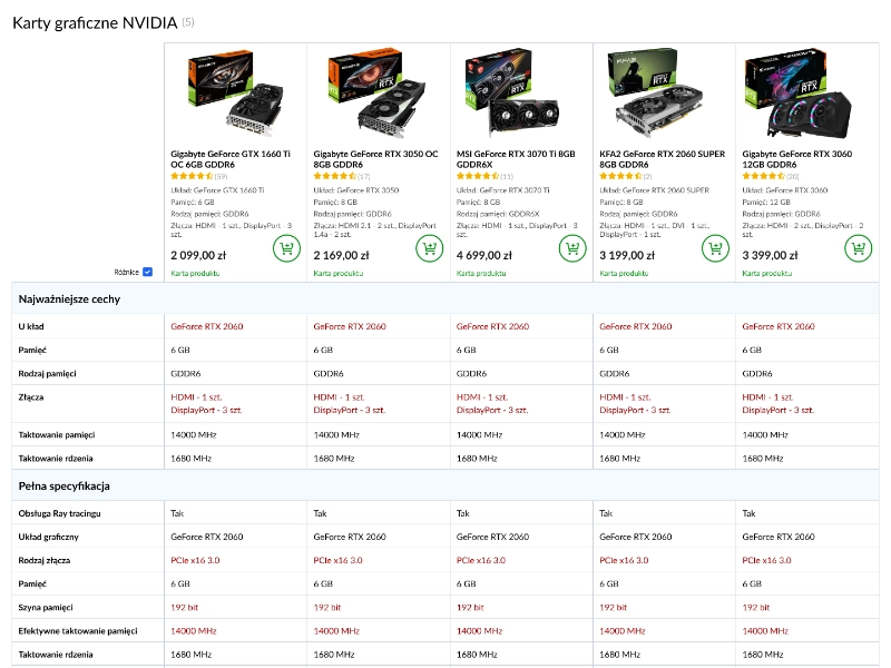
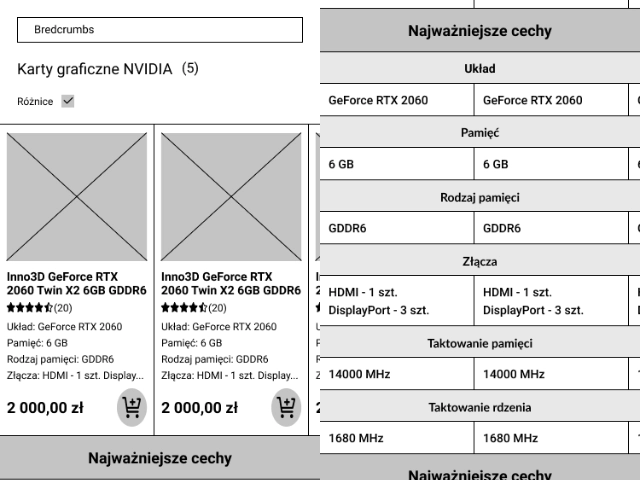
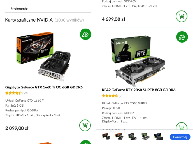
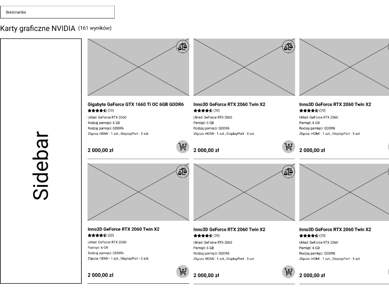
Five desktop wireframes and four mobile wireframes established the structural logic of the platform: listing browse, comparison view, detail drawer, filter/sort panel, and empty/loading states. Wireframes were deliberately device-agnostic in layout logic — the responsive adaptation was designed in, not bolted on later.
Each screen went through a stakeholder review before advancing to visual design. Annotations called out every dynamic region, configurable component, and conditional state so nothing was ambiguous at the UI stage.
 Wireframing
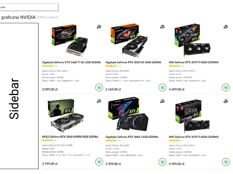
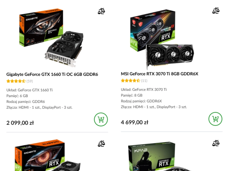
The visual layer was designed with tokenisation in mind from the start — colour, typography, spacing, and border-radius are all defined as variables so any white-label client can apply their brand identity without touching component structure. Five desktop and four mobile UI screens were produced to pixel-perfect standard.
Typography pairs a neutral sans-serif for data-dense comparison tables with a more expressive display face for marketing-facing sections. The layout system uses a clear visual hierarchy to guide users from overview to detail without overwhelming them with simultaneous options.
 UI Design
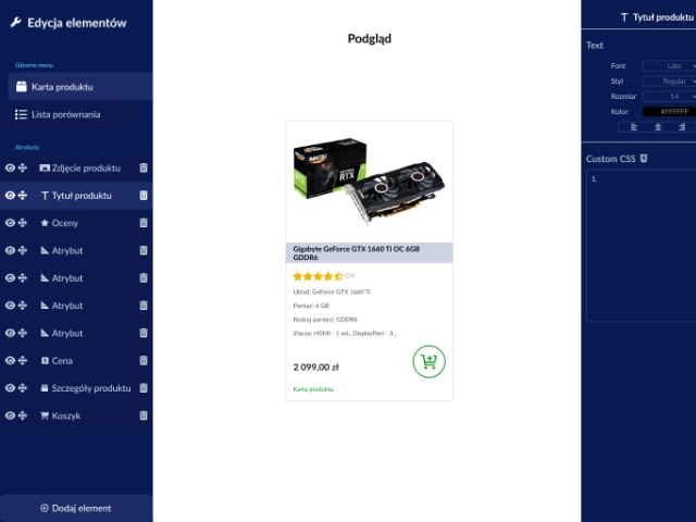
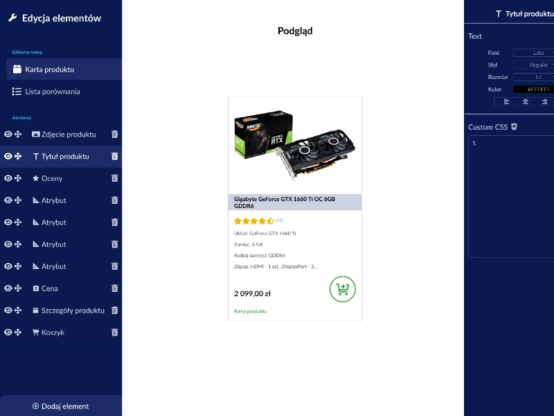
The admin interface was designed as a standalone product within the project — a back-office tool enabling client staff to manage listings, define comparison attributes, set display rules, and publish changes without developer involvement. The UX prioritised discoverability over power-user density: progressive disclosure keeps the interface approachable while exposing full configuration depth when needed.
A live preview mechanism was designed into the admin panel, allowing editors to see how their configuration changes will render in the public-facing comparator before publishing — eliminating a key source of errors and reducing back-and-forth with the technical team.
 Admin Tool