All Work
UX Research Information Architecture Desk Research Card Sorting

Tourism
Sector


Client
Polish Travel Agency
Year
2021
Role
UX Researcher
Category
UX Research · Information Architecture
Deliverables
Research Report

A research-driven deep dive into the Polish travel industry. Mapping user behaviours, decision triggers, and booking pain points from first click to confirmed reservation.

A mid-size Polish travel agency was struggling to convert traffic into bookings. Their platform lacked clarity around destination information, pricing transparency, and the trust signals that users actually rely on when choosing a holiday abroad. The brief: understand the real traveller, then redesign the information architecture from first principles.

The project deployed six complementary UX research methods: desk research, in-depth interviews, empathy mapping, persona development, user journey mapping, and a card sorting study with ten participants. Building a 360° picture of how Polish travellers discover, compare, and commit to booking holiday packages online.

Findings challenged several of the agency's core assumptions. Trust and social proof consistently outranked price as a primary decision driver, and navigation patterns revealed a significant gap between how the team structured their content and how users actually expected to find it.

How the
research unfolded

01 - Desk Research

Mapping the Polish tourism landscape

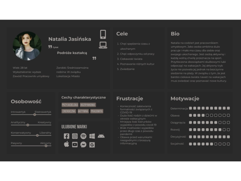
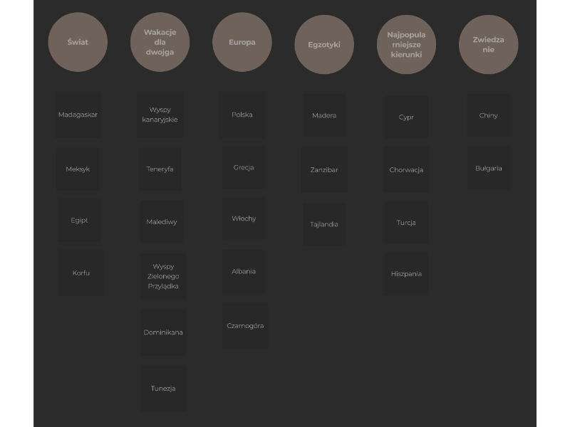
The engagement opened with a comprehensive analysis of the Polish outbound tourism market. Benchmarking ten leading travel portals against industry data on destination popularity, seasonal booking patterns, and digital channel usage. Turkey (30%), Greece (25%), and Tunisia (15%) dominated booking volumes, while Egypt was emerging as a high-interest, low-share opportunity ripe for visibility.

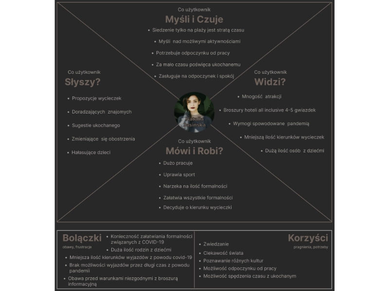
Competitor evaluation revealed a consistent pattern across the market: price-first layouts with buried trust content. Credentials, verified reviews, and cancellation guarantees, the very things users needed to convert, were pushed below the fold or hidden in footnotes. This misalignment between what users required and what sites delivered became the central design problem.

Desk research findings — tourism market analysis with destination popularity data Desk Research
02 — Interviews & Empathy

Getting inside the traveller's mind

Eight in-depth interviews with Polish holiday-seekers, spanning young couples, family groups, and solo travellers. Uncovered a layered, non-linear decision-making process that analytics alone could never capture. Users described moving repeatedly between inspiration, comparison, and doubt before finally committing to a booking, often days or weeks after first visiting the site.

Empathy mapping sessions made the emotional journey visible for the first time: excitement at destination discovery, mounting anxiety during price comparison, sharp frustration when cancellation policies were buried in fine print, and genuine relief only once a confirmation email arrived. These insights reframed the design brief, from "simplify checkout" to "build trust and confidence at every stage of the journey."

Empathy mapping workshop output — traveller emotions, needs, and frustrations visualised Empathy Mapping
03 — Personas & Journey Map

From insight to actionable user models

Three primary personas crystallised from the interview data: the Bargain-Seeking Family (budget-driven, high-volume destinations, safety-first), the Experience-Driven Couple (premium exotic locations, strong photo and review needs), and the Solo Adventurer (flexible dates, community validation, solo-friendly filtering). Each carried distinct information needs, risk tolerances, and booking triggers, requiring separate content hierarchies to serve effectively.

The User Journey Map traced the full customer arc from initial inspiration (social media, friend recommendations) through destination shortlisting, price comparison, trust evaluation, booking, and post-purchase support. Five critical friction points were identified, most clustering around information architecture failures: content buried under generic categories, destination pages lacking peer reviews, and FAQ structures that answered agency questions rather than traveller questions.

User persona cards and journey map showing three traveller archetypes and their booking paths Personas & Journey Map
04 — Card Sorting & IA

Designing navigation people actually understand

An open card sorting study with 10 participants tested how users naturally grouped 52 content items. Destinations, service categories, support topics, and promotional content. The results were striking: participants created 40% fewer top-level categories than the existing site offered, consistently favouring broad, intuitive groupings over the agency's internal taxonomy.

A revised information architecture was proposed: primary navigation collapsed from nine items to five, social proof content (reviews, photo galleries, booking guarantees) elevated to top-level visibility, and destination pages restructured around traveller questions rather than service descriptions. Based on task simulation benchmarks, the new IA was projected to reduce average task completion time by approximately 35%. Directly addressing the conversion drop-off the client had been struggling to explain.

Card sorting results and revised information architecture diagram for the travel agency platform Information Architecture
40%
Fewer top-level nav categories preferred by users in card sorting vs. the existing structure
35%
Projected reduction in task completion time with the proposed information architecture
#1
Trust & social proof ranked above price as the primary conversion driver across all user segments