A tested and iterated branch and ATM locator, designed to get users to the nearest point as fast as possible, on any device.
The project covered the UX design of an advanced search tool for a financial sector client. Enabling users to locate bank branches, service points, and ATMs quickly and intuitively. The client offered modern banking products through both digital and physical channels, and needed the locator to deliver a consistent, frictionless experience whether accessed from a desktop browser or a mobile device.
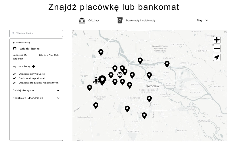
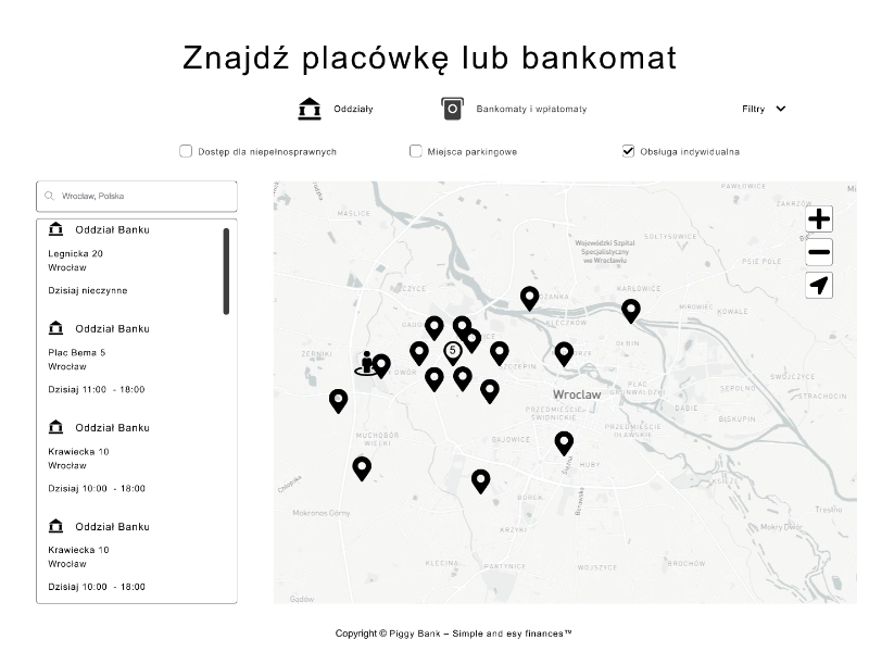
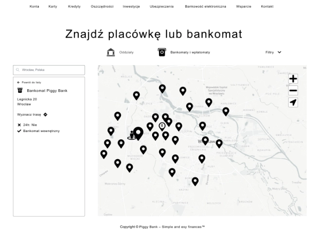
Six core requirements shaped the entire design: full responsiveness across breakpoints, search modes for branches and ATMs separately, an interactive map, automatic and manual location detection, granular filters (24h availability, internal vs. external ATM, disabled access, parking), and rich detail views with opening hours, contact information, appointment booking, and Google Maps route integration.
The deliverable set was comprehensive, high-fidelity wireframes across desktop and mobile for both the branch and ATM search flows, backed by interactive prototypes used in two rounds of user testing that directly shaped the final layout.
The brief arrived with a clearly defined feature list, but turning six discrete requirements into a single coherent experience required careful information architecture work upfront. The key tension was between the map and the list, both are primary navigation surfaces for a locator tool, and neither can be treated as secondary without losing users who prefer the other mode.
Existing bank locator tools were audited to understand where they succeeded and where they created friction, particularly around filter discoverability, the transition between map and detail view, and the handling of location permission requests on mobile. These findings fed directly into the wireframe brief.
 Discovery
Given the complexity of the filter and state logic, wireframes were produced at high fidelity rather than low, making interactions concrete enough to test with real users without waiting for visual design. The scope covered both search modes (branches and ATMs) across both platforms.
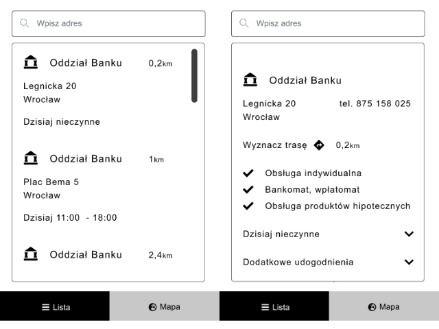
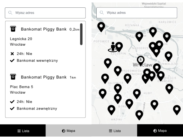
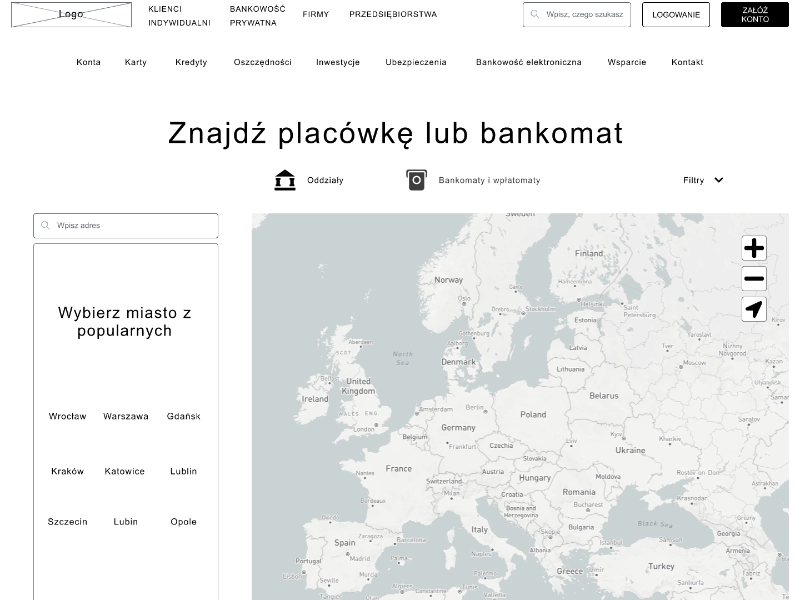
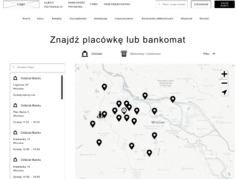
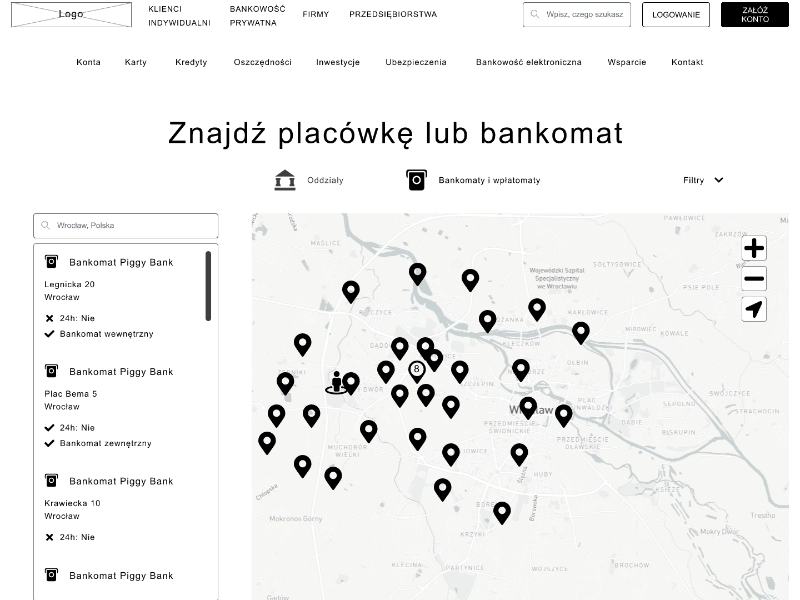
Desktop wireframes included: homepage, city results view, branch/ATM detail, opening hours panel, amenities panel, and four filter variants per mode (general, disabled access, parking, individual service for branches; general, internal, external, and 24h for ATMs). Mobile wireframes spanned eight screens for the branch flow and five for the ATM flow, each accounting for the spatial constraints of a small-screen map interface.
 Wireframing
Interactive prototypes were built from the high-fidelity wireframes, connecting the full search flow for both branch and ATM modes, from entry point through results, filtering, map interaction, and detail view. The goal was to create something testable in conditions close enough to a real product that feedback would be actionable rather than hypothetical.
Two prototype variants were prepared for the first round of testing: the initial layout concept (full-width map with results in a modal overlay) and a challenger layout with the list positioned as a persistent panel. This set up the first round of testing with a clear question to answer.
 Prototyping
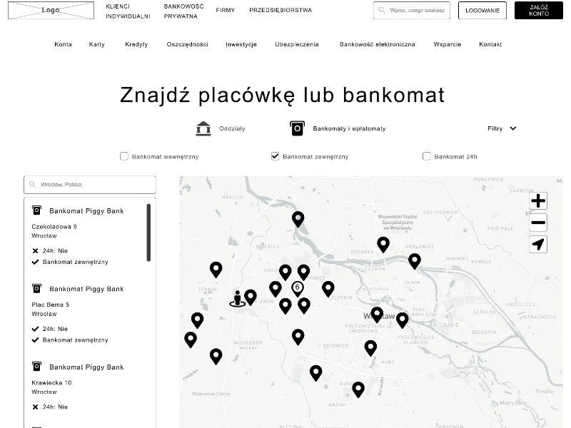
Testing was conducted with a small group of participants spanning different levels of digital fluency, a deliberate choice for a tool that would be used by the full breadth of a bank's customer base, not just tech-comfortable users. The initial design, full-width map with the results list surfaced as a modal, failed clearly: participants found it disorienting to switch between the spatial overview and the list, and the modal felt like an interruption rather than a companion.
The results list was repositioned to a persistent left-hand panel alongside the map, making both surfaces simultaneously visible. A second round of testing with the revised layout confirmed the change: users navigated more confidently, spent less time reorienting between views, and completed the core task. Finding and getting directions to a specific branch, faster and with fewer errors. The validated layout became the final handoff.
 User Testing