An iOS app for blood donors motivating without pressuring, with gamification that puts recovery before competition.
The project called for designing the mobile interface for a blood donation app tied to a social awareness campaign. The brief was clear on one thing above all: the app had to be visually engaging and encouraging, not clinical, heavy, or guilt-driven. Blood donation carries genuine weight as a topic, and the design needed to honour that without becoming an obstacle to participation.
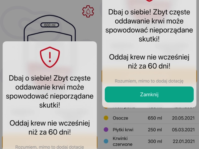
The central design challenge was tone. Gamification elements, progress tracking, donation history, contribution milestones. Were included to motivate donors, but with a deliberate emphasis on responsible behaviour. Recovery time between donations matters as much as frequency, and the interface needed to communicate that without feeling like a lecture. Celebration and caution had to coexist.
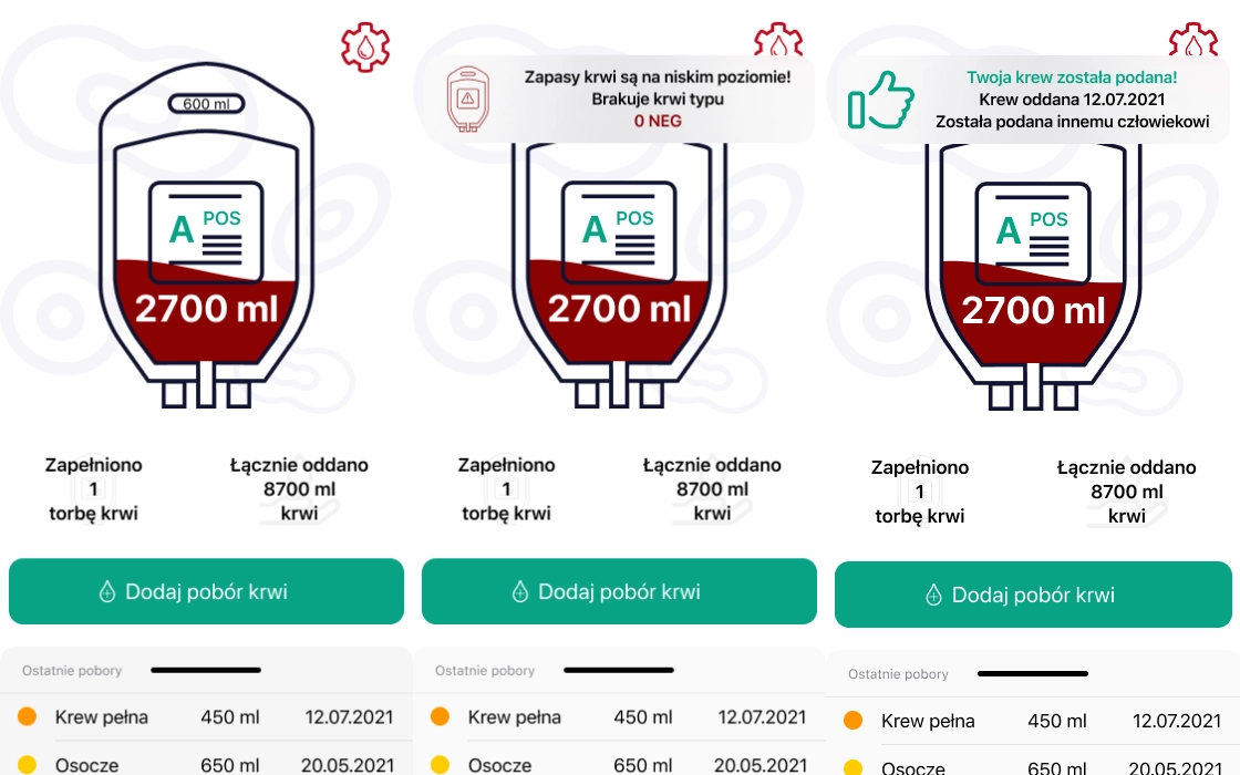
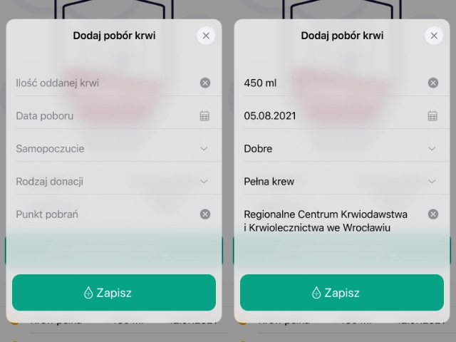
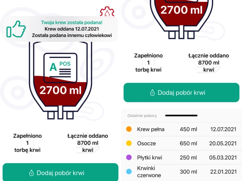
Nine screens were designed for iOS, covering the full donor journey: home dashboard, blood supply status, donation logging (empty and filled states), history view, confirmation feedback, and error handling. Every state a user might encounter, designed with the same care as the hero screens.
The research phase focused on two parallel tracks: understanding the blood donation process itself. Its medical requirements, recommended recovery intervals, and the psychological profile of regular donors and studying how health and social-good apps handle motivational design without veering into manipulation or anxiety.
Apps like Strava and Duolingo provided useful reference points for responsible gamification: streak mechanics that encourage consistency without punishing breaks, progress visualisations that feel rewarding rather than pressuring. These principles were adapted to the specific context of blood donation, where the stakes of irresponsible motivation are genuinely high.
 Research
Before any visual decisions were made, the tonal direction was established: warm but not trivial, motivating but not competitive, informative but not clinical. This shaped everything from colour temperature and illustration style to how confirmations and errors were written and presented.
Several visual concepts were explored, a more stripped-back medical aesthetic was rejected early in favour of an approachable palette and friendly typographic hierarchy that would make the app feel like a companion rather than a health record. The gamification layer was designed to surface only after core actions, keeping the primary experience focused on the donor rather than the metrics.
 Concept
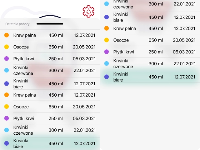
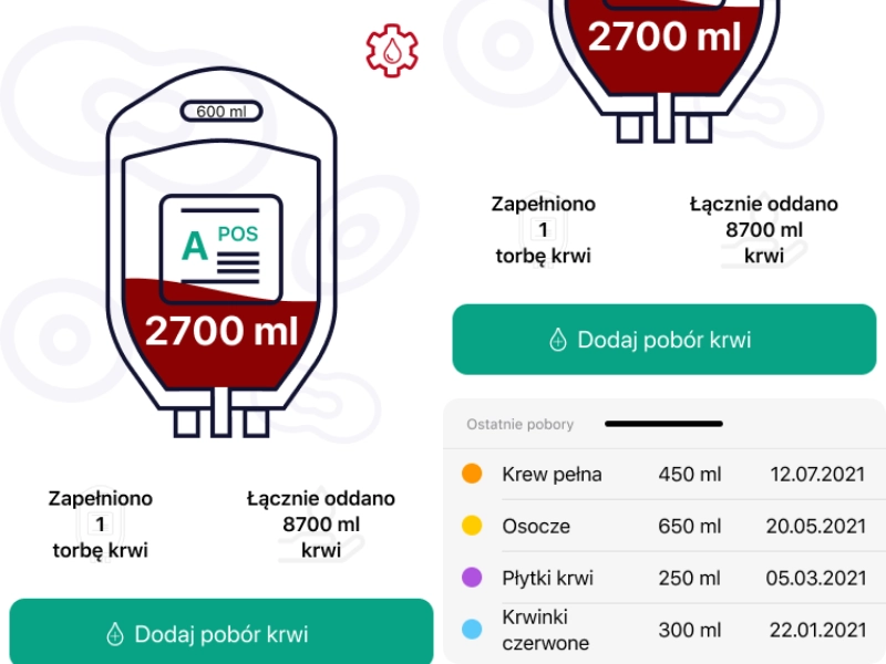
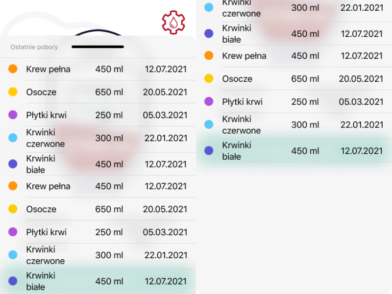
The full screen set was designed to iOS standard, covering the complete donor journey. The home dashboard surfaces blood supply status and the donor's personal history at a glance. The two pieces of information most likely to motivate action. Donation logging handles both the empty and pre-filled states, with clear input validation and a confirmation screen that rewards the action without overstating it.
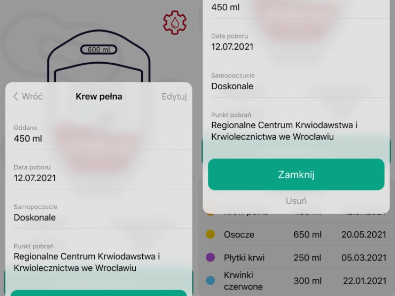
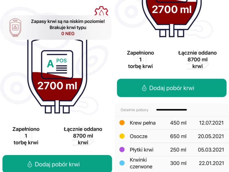
Equal attention was given to the less visible screens: the error state for a failed donation submission was designed with the same care as the success state, clear, calm, and actionable. The history view gives donors a tangible record of their contribution over time, reinforcing the sense of ongoing impact that sustains long-term participation.
 UI Design
The gamification system was designed as a layer over the core app rather than its engine, donors who ignore it entirely still have a complete, functional experience. For those who engage with it, progress is framed around personal milestones and recovery compliance rather than leaderboards or competitive ranking against other donors.
Visual feedback for donation milestones was designed to feel genuinely celebratory a moment of recognition that doesn't immediately redirect the user to their next target. The messaging throughout the gamification layer was crafted to reinforce the real-world significance of each donation: lives potentially saved, not points accumulated.
 Gamification