A precision-crafted drawing tools interface for a fintech iOS app. Where financial data meets intuitive annotation.
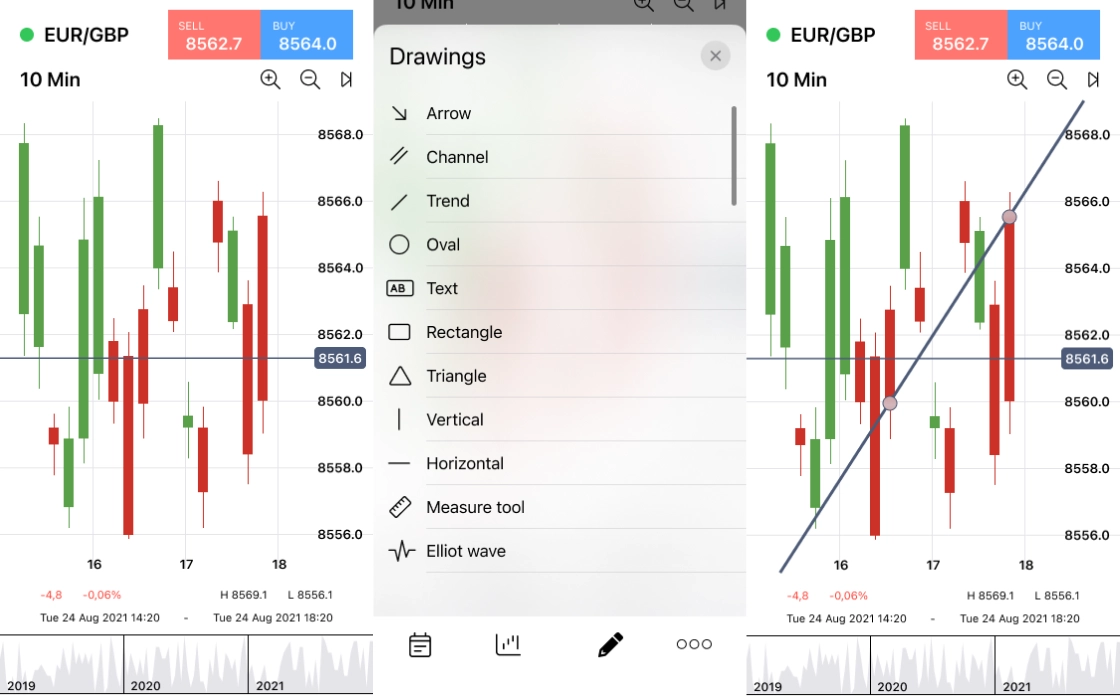
The project centred on designing the mobile interface for a fintech company's iOS application, with a specific mandate: design and optimise the "Drawing Tools" section. This feature set lets users annotate financial charts and data views directly on their device, drawing lines, marking key levels, and customising visual indicators in real time.
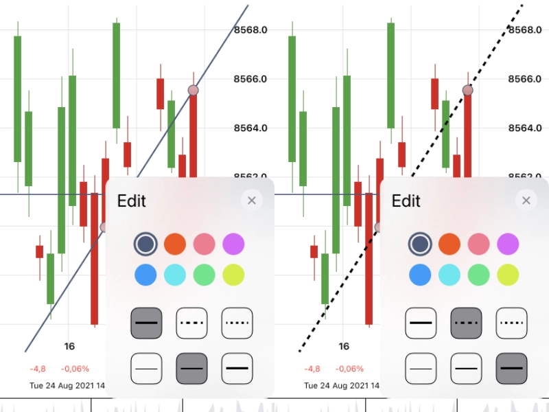
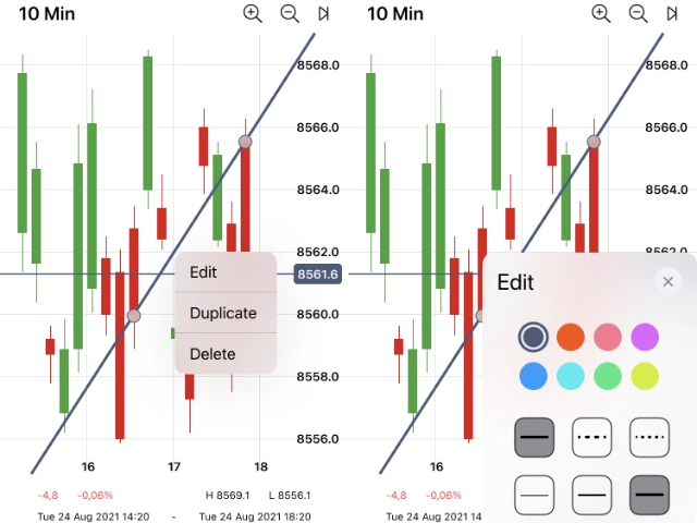
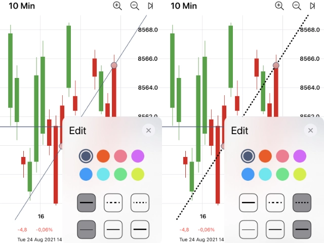
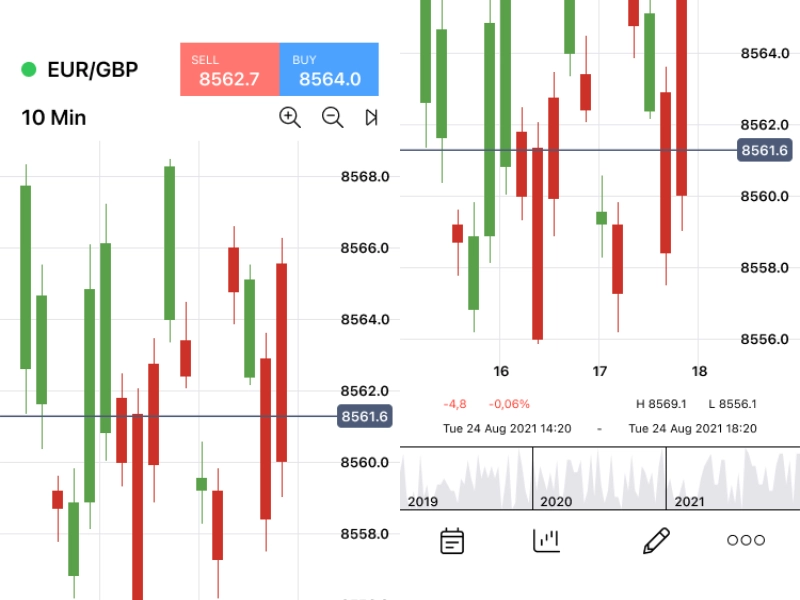
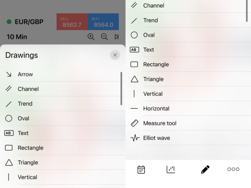
The challenge was balancing the precision demanded by financial professionals with the ergonomic constraints of a touchscreen. Every interaction had to feel deliberate and accurate, while remaining fluid enough for fast-moving market conditions. The full screen set spanned the home view, navigation menu, core drawing canvas, and a complete suite of tool-state variants, thin, medium, dashed, dotted, and colour-coded line options.
An interactive prototype was produced alongside the static screens, enabling the client to test and refine drawing tool interactions before committing to development. Compressing the feedback loop and arriving at a validated solution faster.
Designing for fintech users, particularly those working with chart annotation, requires understanding a domain-specific mental model that differs sharply from general consumer apps. I audited leading financial platforms on iOS, mapping how professional-grade drawing tools were implemented, where they fell short on mobile, and what conventions were so entrenched that deviating from them would introduce friction.
Apple Human Interface Guidelines formed the baseline, but fintech use cases pushed beyond standard HIG patterns. Particularly around touch target sizing for precise annotation and tool state persistence between sessions. These became the guiding constraints for every design decision.
 Research
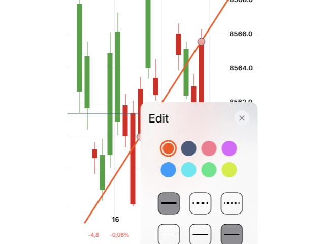
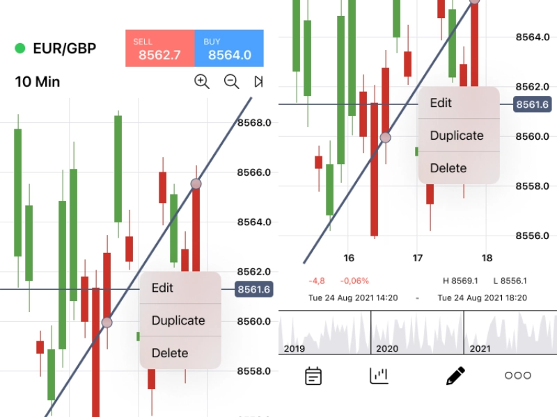
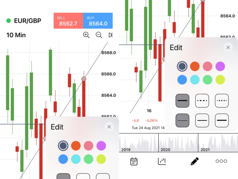
The drawing tool section involves a deceptively high number of states: idle canvas, active drawing, line selection, edit mode, style panel (open and closed), and individual property controls for line weight, style, and colour. Each state transition was mapped before any screen was designed, ensuring no interaction was left undefined.
The flow from the home screen through the menu into the drawing canvas and back out again without losing work. Was treated as a primary journey and stress-tested for edge cases: accidental navigation, interrupted sessions, and simultaneous gestures on a financial chart.
 UX Flow
The visual design adheres to iOS standards while reflecting the high-stakes context of financial tooling, dark backgrounds to reduce eye strain during extended sessions, accent colours used exclusively for functional signalling rather than decoration, and a typographic system that prioritises numerical legibility at small sizes.
Ten distinct screens were designed to pixel-perfect standard: the home view, menu, primary drawing canvas, edit mode, editing panel, and five line-style variants (thin, medium, dashed, dotted, and purple). Each variant demonstrates the full consistency of the design system under different tool states.
 UI Design
An interactive Figma prototype connected all ten screens into a testable experience, replicating the drawing tool flow as closely as a static prototype allows. The client team used this to walk through the end-to-end interaction on real devices, surfacing usability issues that would have been invisible in a static review.
Two rounds of prototype testing resulted in targeted refinements to the tool selection panel and the edit/confirm interaction. Changes that were straightforward to make in design but would have been costly to revisit post-development. The validated prototype became the direct handoff artefact for the iOS engineering team.
 Prototyping